

Same structure. Different character.

A Swedish plastic surgeon chose our Minimal / Editorial direction. The patient journey stayed. The visual identity became entirely his.

Plastic surgeon website design case study homepage

About this project

The surgeon had seen our Dr Mercer website and responded to its calm pacing, generous space and editorial use of photography.

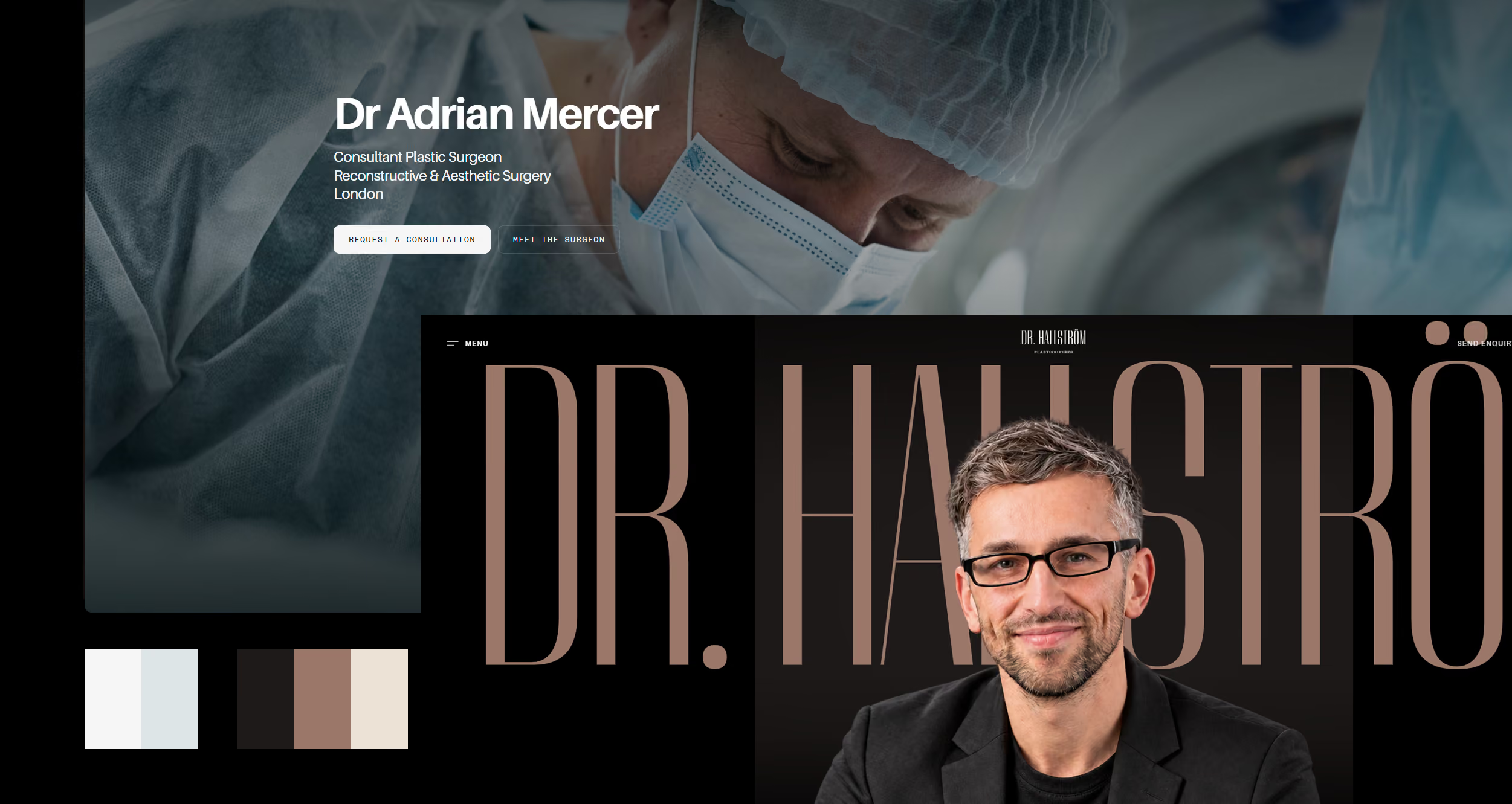
He wanted the same considered feeling, but not the same identity: a darker palette, warm copper details, more expressive typography and a stronger personal presence.

A clear direction at the beginning removes dozens of small design decisions later. It is one reason this project moved quickly.

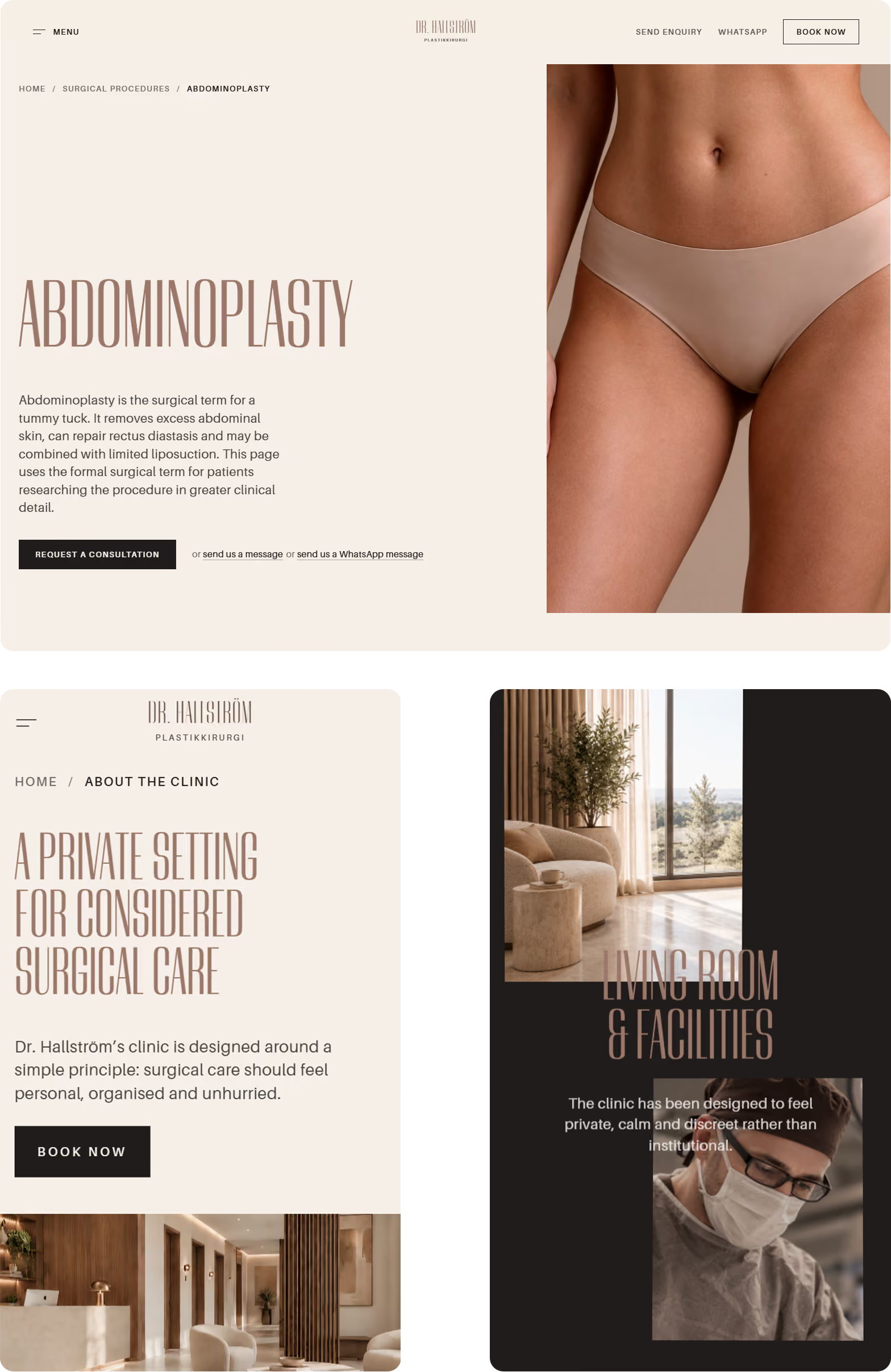
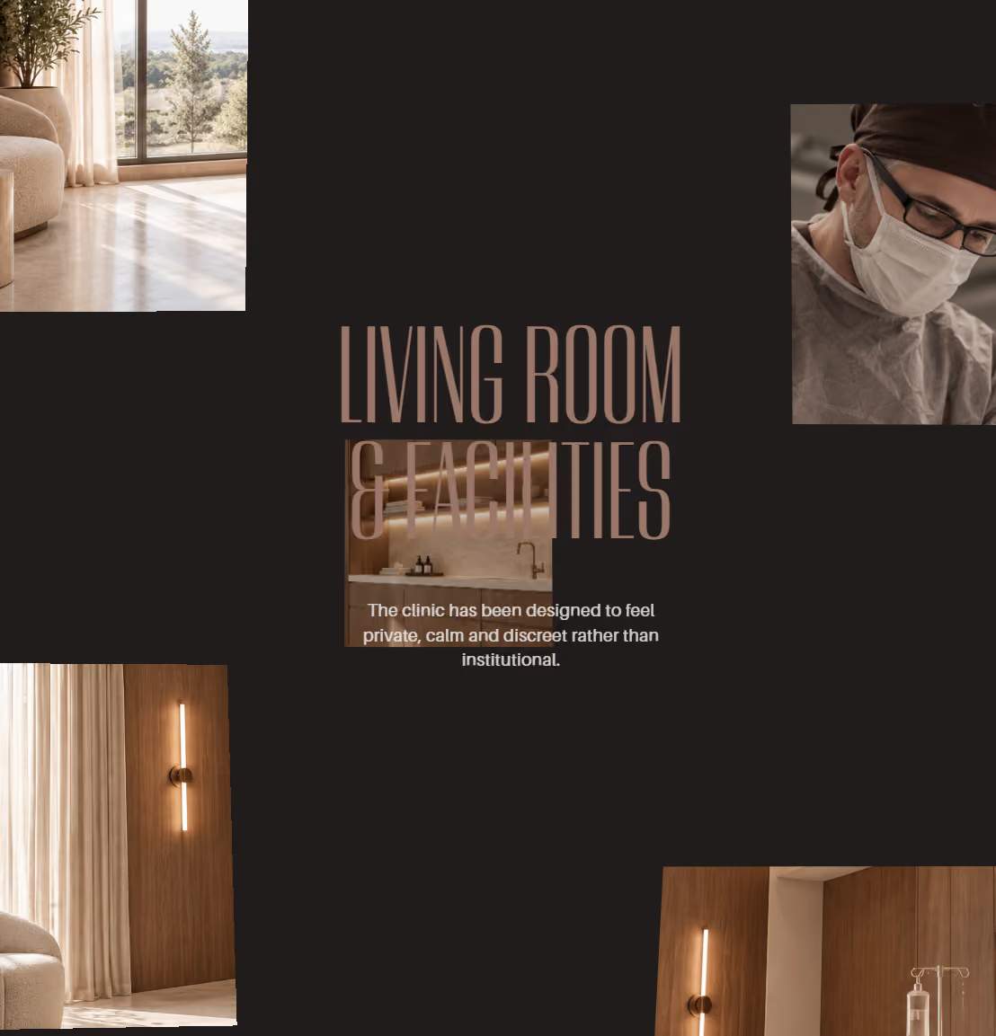
Editorial page layouts from a plastic surgeon website design case study

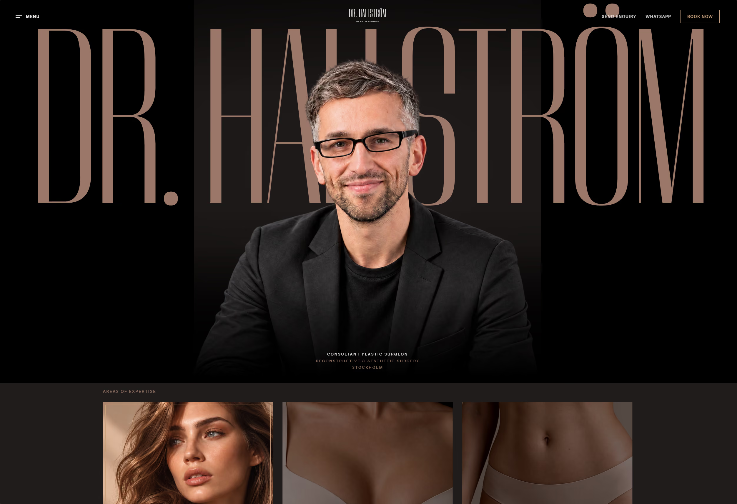
The name becomes part of the composition.

Instead of placing the surgeon’s name quietly in the header, we used it as the main graphic element of the opening screen.

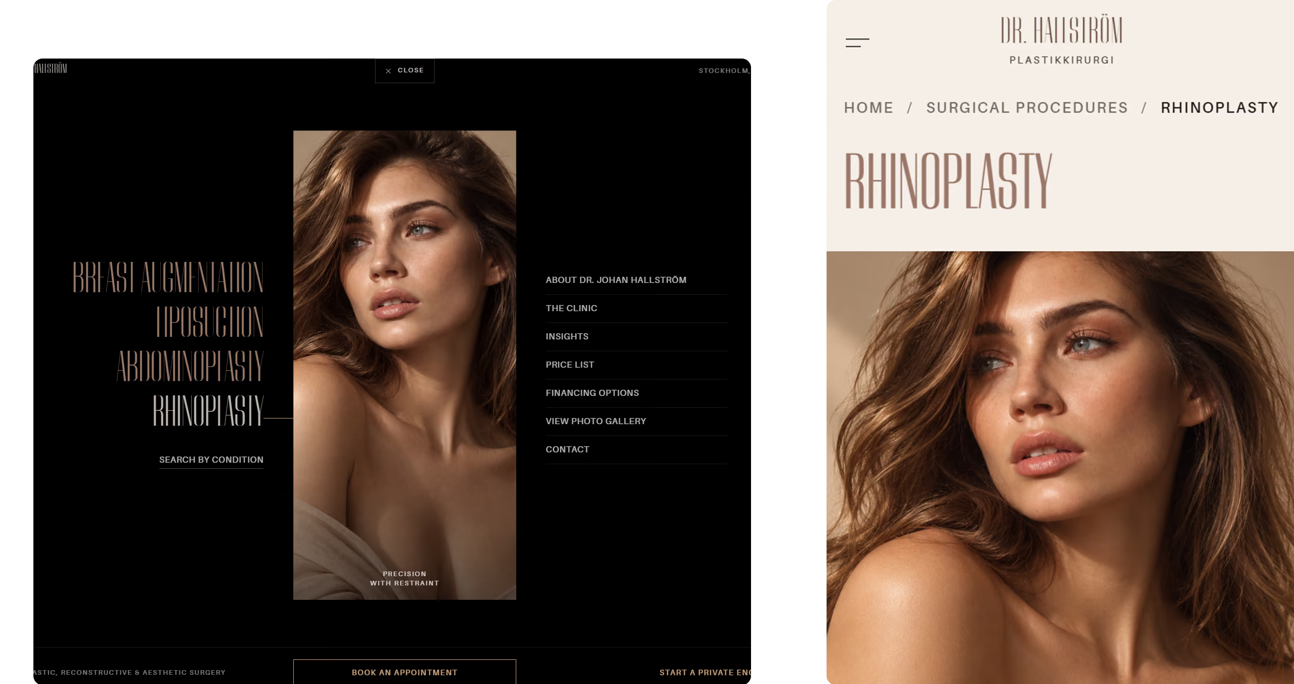
Typography and navigation layouts for a plastic surgeon website

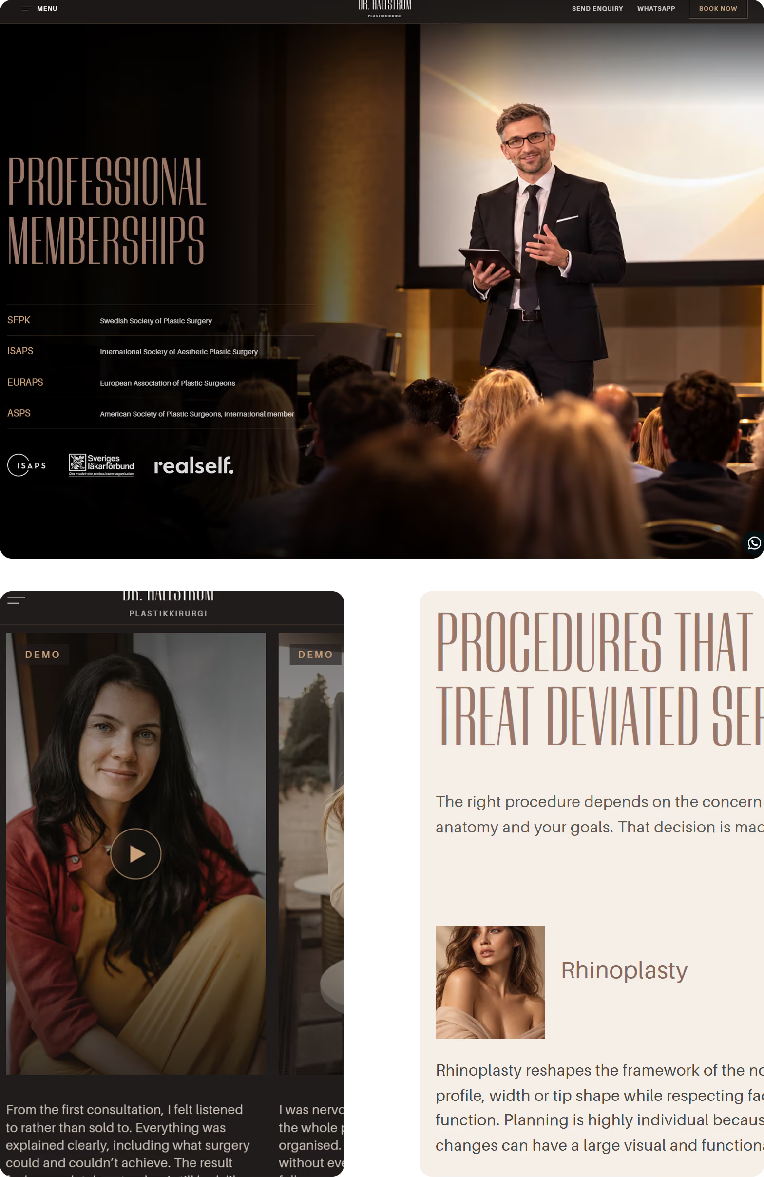
The navigation received the same treatment. Procedures appear in large type, with imagery changing as patients move through the list. They can also search by condition or continue to the surgeon, clinic, pricing and contact information.

Mobile navigation and procedure layouts for a plastic surgeon website
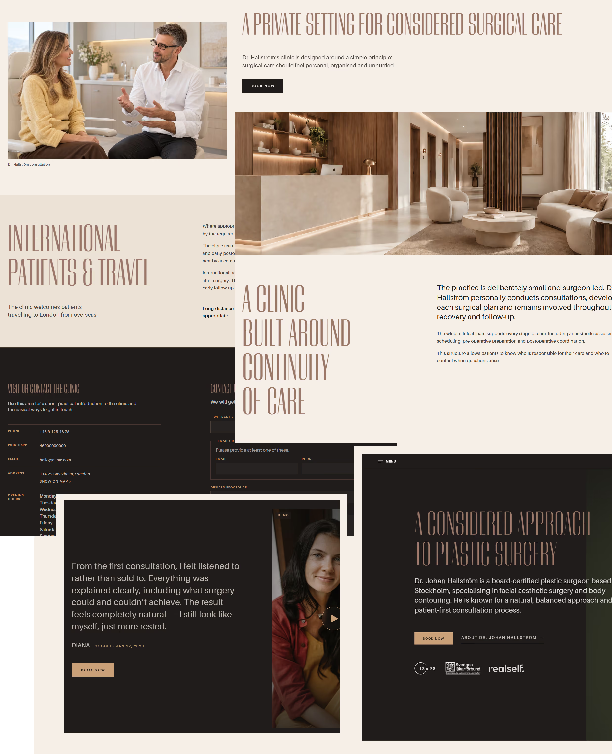
Patient-focused layouts from a plastic surgeon website design case study
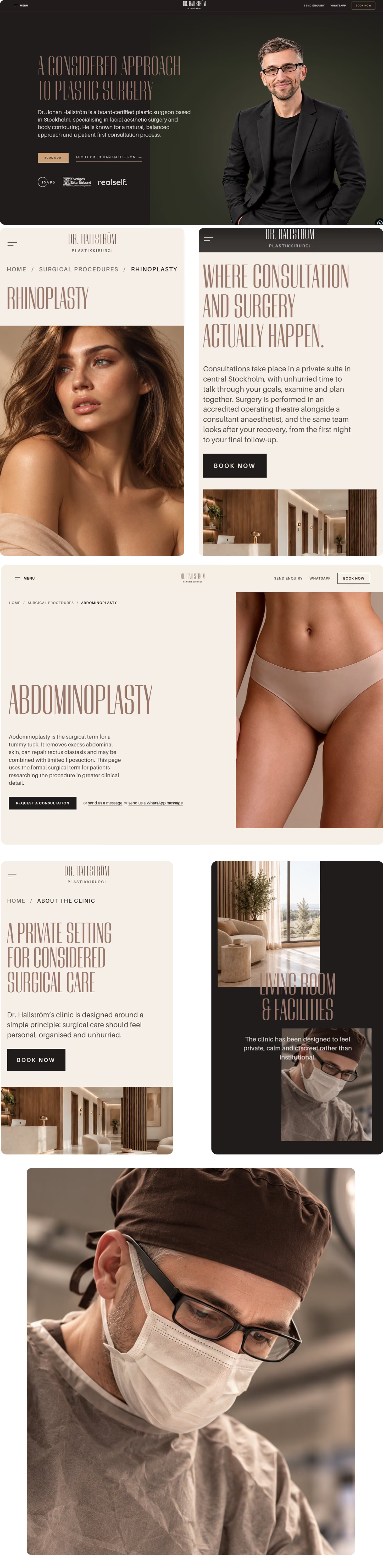
Dark editorial plastic surgeon website homepage

Dr Mercer is light, cool and clinically calm. Dr Hallström is dark, warm and distinctly editorial. The typography, imagery, palette, navigation and overall rhythm changed.
For this surgeon we went further, with background video and custom interactions, because on a personal-brand surgeon's site the identity is the product.

The patient journey stayed intact: concern, procedure, surgeon, pricing and consultation—all connected.

I liked the Dr Mercer theme and started from this. I shared the content and a few examples of what I liked, and the team understood exactly what I was looking for. The first design was a real surprise—I honestly didn’t expect something this good so quickly. We approved it on day one, and two days later the whole website was live. Everything went smoothly, with very little back and forth. Special thanks to Nat, who led the design work and really brought the whole thing together.

Dr J. H.,
Plastic surgeon, Sweden
Live in two days. Nothing skipped.

With the direction confirmed and all materials in, the design was approved on day one and all 46 pages went live on day two.

That speed comes from a patient journey, content model and component system already built for plastic-surgery practices, so the time goes into what makes this surgeon distinctive, not into rebuilding foundations.

Already in place: connected procedure and condition pages, structured data for practitioner and clinic, responsive layouts, accessibility checks, technical SEO, sitemap, analytics and consent foundations.

We don't promise rankings. We make sure the site is clear to patients and ready for search engines.

  • SEO foundation
  • Structured data
  • Performance-first
  • WCAG-aware
  • Mobile-first
  • Analytics-ready
  • Consent-ready
Responsive page layouts from a plastic surgeon website design case study

Could this structure become your clinic?

Start with one of our four visual directions. We adapt it to your practitioners, procedures, photography, colours, content and patient journey.

Send us your current website or one reference you like. We will tell you which direction fits—and whether an adaptation is enough or your project genuinely needs a bespoke build.

Contact us

Thank you! Your message has been sent.

We’ll reply by email within 12 hours.
Your message could not be sent. Please try again in a few moments.
```